

Balancing bold and neutral shades can make your home look stylish without appearing too heavy. A strong colour adds depth, while a soft neutral shade keeps the space calm and neat.

The right home paint combination should match your room size, lighting, furniture, and the overall look you want to create.
Why Bold and Neutral Shades Work Together
Bold colours make a room look rich and interesting, while neutral colours balance them and keep the space simple. When used together, they create a clear contrast without making the room look too dark or heavy.
This approach works well because the bold shade becomes the main highlight, and the lighter shade keeps the remaining walls neat. It is a useful idea for living rooms, bedrooms, dining areas, and study corners.
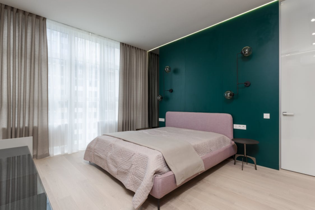
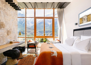
How to Use Bold Colour in a Balanced Way![]()
Bold colour like burgundy colour is deep, warm, and rich, so it works best when used with care. Instead of applying it to all walls, use it on one main wall, such as behind the sofa, bed, TV unit, or dining console. This makes the wall stand out while lighter neutral shades keep the room balanced and open.
Neutral Shades That Match Bold Wall Colours
Neutral shades such as cream, beige, off-white, soft grey, taupe, and light warm tones can pair well with bold wall colours. These shades reduce the intensity of deeper colours and make the room easier to style.
With burgundy, lighter neutrals can create a clean contrast. Cream and beige can add warmth, while off-white can make the room look brighter. Soft grey can also work well if you want the overall colour combination to look more modern.
How to Plan a Home Paint Combination
Before choosing wall colours, look at the main things already in the room, such as flooring, furniture, curtains, wardrobes, and lighting. If these are dark, keep most walls in a lighter neutral shade.
Use the bold colour only as the main highlight. This makes the home paint combination look balanced and well planned. Always test a small patch before painting the full wall, as colours can look different in natural and artificial light.
Simple Styling Ideas for a Better Finish
A bold and neutral wall combination looks better with simple décor. Avoid too many dark curtains, dark furniture, or heavy wall pieces, as they can make the room feel heavy.
Choose wooden finishes, light curtains, beige fabrics, brass accents, or soft artwork instead. For a balanced feature wall, Nerolac Impressions Ideaz adds depth with a designer matt finish without needing extra décor.
Final Thoughts
Balancing bold and neutral shades means using strong and soft colours in a planned way. A deeper shade can add richness, while neutral shades can keep the overall look calm and usable.
If you choose burgundy colour as the bold shade, pair it with lighter tones so the room does not look too heavy. The best result comes when your wall colours match the room size, lighting, furniture, and purpose.


