

Color selection plays an essential role in defining the overall look and feel of a commercial space. It’s not just about decoration; colors can shape first impressions, reflect professionalism, and create a welcoming atmosphere for both employees and customers. The right combination can make a space appear larger, brighter, or more cohesive, helping to set the tone for how people experience your business environment.


In this blog, we’ll explore how understanding the purpose of the space, the psychology behind colors, and the interaction between lighting and branding can help you create a setting that’s both functional and visually appealing.
Understand the Purpose of the Space
Before selecting a color palette, it’s important to understand the purpose and function of your commercial space. Every business environment serves a unique goal, and the colors you choose should complement that purpose. For instance, the mood you create in an office won’t be the same as what works for a restaurant or retail store.
Hence, thoughtful color planning helps enhance comfort, focus, and the overall experience for anyone who steps inside. Here’s how color choices can differ based on the type of space:
- Offices: Use neutral or cool tones like light gray, beige, or soft blue to promote concentration and reduce stress. A touch of royal blue color can also add a sense of professionalism.
- Restaurants and Cafes: Warm, inviting hues such as terracotta, mustard, or earthy tones encourage appetite and social interaction.
- Retail Stores: Bright and vibrant colors like yellow, coral, or teal can grab attention and energize the shopping experience.
- Clinics and Wellness Centers: Soft, calming shades such as mint green, white, or pastel blue create a sense of cleanliness, peace, and relaxation.
- Creative Studios: Bold, inspiring colors like deep orange or emerald green can spark imagination and motivation.
Understanding Color Psychology
Colors speak to people on a subconscious level by setting moods, shaping perceptions, and guiding behaviors without us even realizing it. In a commercial setting, leveraging color psychology helps you design a space that supports your goals, whether that’s encouraging productivity, comforting visitors, or energizing customers. For this reason, knowing what feelings different colors evoke is key to creating an environment that works for both your team and your customers.
Here’s a quick guide to common color associations and how they can be used in commercial settings:
Warm vs. Cool Tones
Warm tones (soft terracotta, muted mustard, gentle coral) bring a sense of energy, warmth, and friendliness. They’re useful where engagement and interaction are key.
In contrast, cool tones (dusty teal, slate, soft sage) feel calming, composed, and trustworthy, making them suitable for areas that need concentration or relaxation.
Muted and Desaturated Tones
These are colors that have gray mixed in, reducing their intensity. Muted tones give a space a more sophisticated, subdued feel and avoid overwhelming the visitor. You can use muted accents or variations of your brand color when you want subtlety rather than bold statements.
Accent and Highlight Tones
Use brighter or more saturated versions of your brand’s core colors as accents or feature walls. These catch attention without dominating the entire space. For example, a muted base color paired with a more vivid tone on trim or around important areas can direct focus.
Balance and Contrast
A well-balanced palette includes both lighter and darker versions of your chosen tones. This prevents the space from feeling flat or monotonous.
Additionally, contrast helps elements like signage, displays, or furniture stand out clearly against walls.
Undertones Matter
Even within the same hue family, different undertones (cool, warm, neutral) shift a color’s impact. A blue with a green undertone may feel fresher, while one with a gray undertone may feel more reserved.
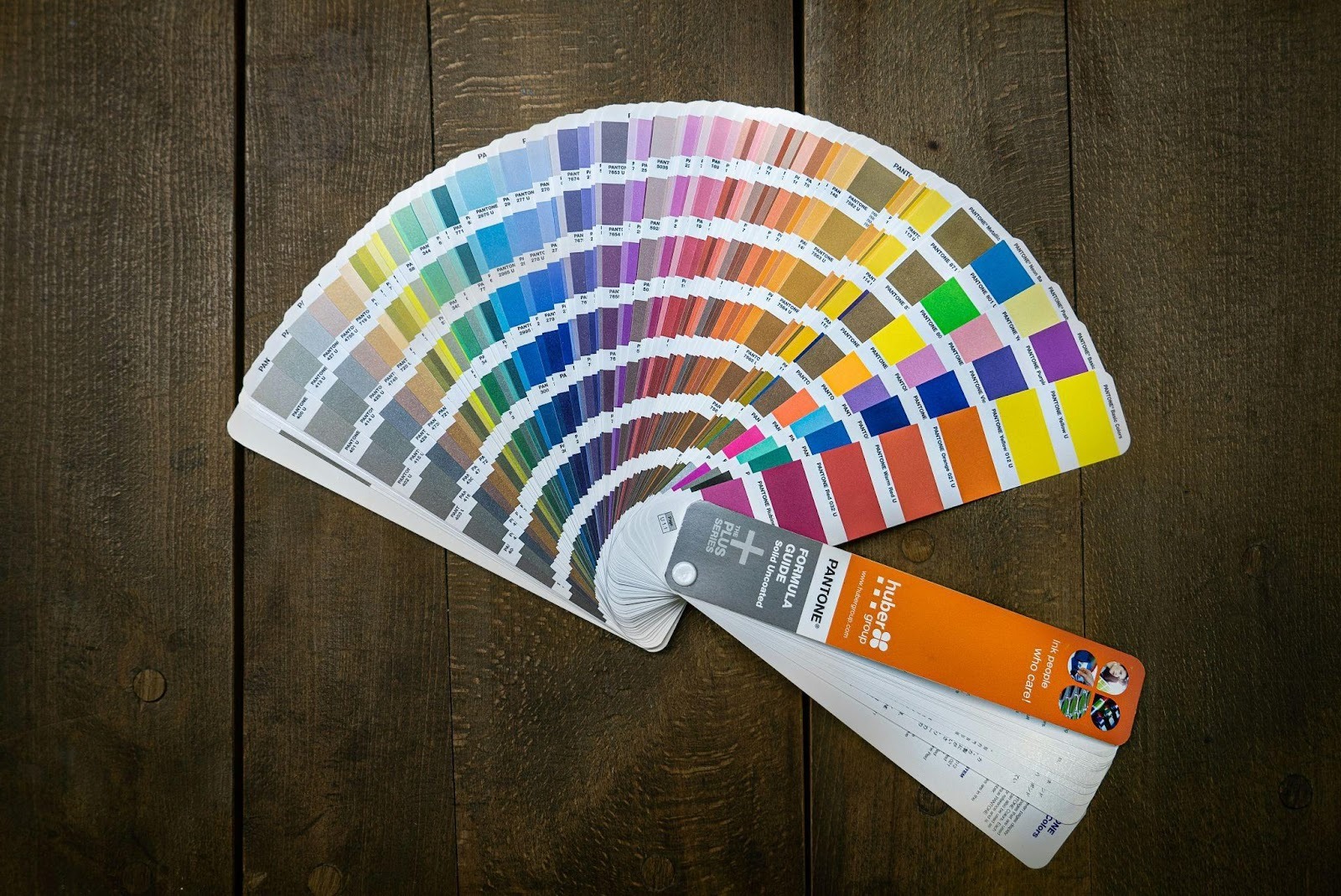
If you’re operating in or near Concord and considering a fresh paint scheme, consulting a commercial painter in Concord can be a smart choice. With their experience and understanding of color psychology, they can help you select tones that not only look appealing but also create the right mood for your business environment.
Balance Light and Space
Lighting (both natural and artificial) has a significant impact on how colors appear in a commercial space. A paint swatch you love under bright daylight might look dull under fluorescent bulbs or cast uneven shadows when light comes in at an angle. Ignoring lighting can lead to surprises, like walls that look “off” at certain times of the day or in certain corners.
Here’s how lighting and space interact with color:
Natural Light Shifts During the Day
Morning, noon, and evening bring different light temperatures and intensities, altering the look of paint. Colors may appear warmer in the morning sun and cooler in the late afternoon.
Artificial Lighting Changes Color Perception
Different bulb types, such as incandescent, fluorescent, and LED, emit light at different temperatures. A bulb with a warm temperature (yellow/red cast) will make cool tones softer, while a cooler bulb (blue/white cast) can make warm tones look washed out.
Additionally, the placement of lighting, such as spotlights, overhead fixtures, and wall sconces, creates shadows or highlights that affect how color is perceived on surfaces.
Intensity and Contrast Affect Vibrancy
In bright, well-lit spaces, colors tend to look more saturated and vivid. In dim or shadowy areas, the same colors may look muted or even dull. Darker tones absorb more light, so in low-light zones they may lose contrast or depth.
Tip: Test Paint in Real Light Before Deciding to Avoid Costly Mistakes
- Paint large sample patches (for example, 1 ft × 1 ft or bigger) on different walls in the actual space. Then observe them at multiple times of day (morning, midday, evening) to see how natural light shifts affect appearance.
- Also, make sure to check it under your artificial lighting too. Move the sample patches around, since walls with different exposures may change how the color appears.
- Use multiple light sources (ambient, task, accent) when testing so you see how the color behaves under combined lighting.
Final Note
Choosing the right colors for your commercial space is a strategic decision that can influence how people feel, behave, and connect with your brand. When done thoughtfully, your color scheme becomes an invisible backbone supporting your business goals.
As you move from planning to execution, remember to revisit your choices if the space feels off, get feedback from those who use it daily, and don’t hesitate to iterate. After all, a well-chosen color palette should serve your space, your brand, and your people all while quietly reinforcing the atmosphere you aim to create.


